Alpha 12

As always, we would love to hear your feedback on every release! Reply here or create another thread.

Here’s the 12th Alpha release, Logic version 2.0.9!

MacOS:
http://logic-io.s3.amazonaws.com/test-builds/Logic-macOS-2.0.9-master.zip
Linux:
http://logic-io.s3.amazonaws.com/test-builds/Logic-2.0.9-master.AppImage
The .AppImage file will require execute permissions, e.g. chmod +x Logic-2.0.8-master.AppImage
Windows:
http://logic-io.s3.amazonaws.com/test-builds/Logic+Setup+2.0.9-master.exe

Alpha Mailing List

Join the Alpha Users Mailing List to be notified about the next release!

What’s new?

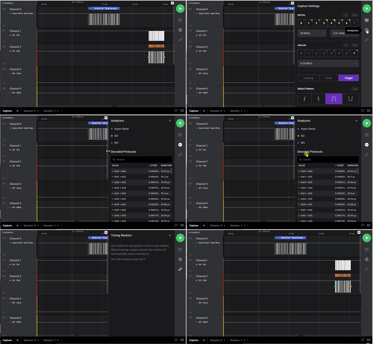
  • New collapsible and resizable sidebar - more room for analyzers and timing markers or just focus on the graph when you need to.
  • New icon! image (not yet on Linux)
  • Timing markers pairs - Select two markers (using Cmd/Ctrl + Click) to create a pair from any two markers
  • New interactions:
    • Double click on an analyzer graph result (“Bubble”) to zoom in
    • Jump from protocol results to the graph position
  • App persistence
    • Load most recent capture settings when launching the app again
    • Load analyzer recent settings when adding a new analyzer

Improvements

  • Save and load captures is now faster and support any size of file
  • Simplified and accurate graph interactions
    • Zoom-in directly on mouse location
    • Cmd/Ctrl to zoom-in or pan the vertical axis
  • Reset button to reset analyzer settings to default
  • Channel minimum height is reduced to 50 pixels to allow viewing more channels at a time
  • The application now remembers its position between runs
  • Application no longer required to be moved to Applications folder on MacOS
  • Right-click menu on protocol result overlay allows you to change display base
  • Protocol result bubbles now use different colors for different channels
  • W/A/S/D keys added to viewport navigation
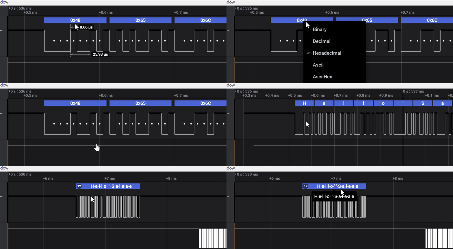
  • Protocol bubbles now have a tooltip that displays their content when the content would not otherwise fit on the display. Works for “multi-bubble” where multiple protocol bubbles are merged into one.

Fixes

  • Channel reordering bugs
  • Disable save/load while save/load is already in progress
  • Ignore dragging unsupported file types
  • Fixed crash on every re-install on Mac
  • Fixed backend crash when using I2C analyzer
  • Validate digital trigger settings when starting the capture
  • Keep capture settings when disconnecting a real device
  • Fixed MacOs crash after ~40 seconds
  • Reset channel label when empty (Thanks Bryan)

Quick Peek of New Features


New protocol bubble tooltip


Right-click protocol bubble to change the display radix


Double click a protocol bubble to automatically zoom in


New sidebar! resizable and collapsible

This is becoming really great!
Actually has me using the Saleae more again.

Loving the change base easily feature.

2 Likes

Great improvement since the last release, feels significantly more stable and snappier than before. One note is that on MacOS the old icon is still there. I haven’t noticed any other issues yet.

Thanks! Yeah that’s a really annoying problem. I haven’t found a better solution than this yet:

There are instructions in there to reset the LaunchServices database.

You can also see the new icon if you change the app’s name. Quite annoying.

Edit: Joe just pointed out that touching the file fixes it!

cd /Applications
touch Logic\ 2.0.app/

Much easier!
Note - this should only be a problem on MacOS.

1 Like

0
Two observations:

  1. There appear to be ‘breaks’ in the analog data. As I zoom in/out they come and go

  2. Is there any way for me to vertically ‘zoom in’ on the analog channel? As it is right now, this channel is taking up 4 time the vertical space that it needs to. (All I need to see is 0V to 5V)

*Brian

Yes, you can vertically zoom and pan the analog channel - but we do need to find a way to make this discoverable. Alpha 12 just changed the keybindings, not control (macOS command) is used with the mouse wheel to zoom and click+drag to pan.

Good catch on the analog rendering artifacts.
The breaks in the analog graph pictured here are a known issue, and we’ve decided to put that off till the third round of analog graph rendering improvements. The vertical jumps in the the data while partially zoomed out are a visual artifact that occurs when samples on the left side of the break are fairly far away in voltage from the samples on the right side of the break. It’s most visible when recording signals like digital data, where the signal rapidly changes in voltage.

There is a lot more we want to do with the analog graphs but it will have to wait until we get back to them. We’re still working on protocol analysis features, for the next few months.

Hi
Love the new Alpha 12. The markers are also great!
I have a suggestion regarding the Analyzers.
Would it be possible to make an option so you can add another digital/analog pin inside the dropdownlists (see screenshot for an roughly idea)suggestion ?
Example: User has selected digital & analog pins [0 & 1]. The user now selects the SPI analyzer and notices that he hasn’t selected enough pins for this. He has to close the Analyzer window, manually add two pins and then head to the analyzers again.

And another thing: I just tried to export around 500 Mb onto my desktop and in the process of that the export window got stuck and it didn’t generate a .zip file with the data in it. I also can’t close the export window with the “Cancel” button.

This is a great idea!
We’ll add that to one of the next releases.

Unfortunately, the export feature is currently unstable. We re-built it from scratch recently and it should be available on the next release (next week probably).

Nice Alpha!
Some feedback:

  • Trigger is nice! It seems to only be in “Single” mode, though. I want it to keep triggering if a new trigger event occurs (probably with a holdoff). Single shot is good to have as an option, but the default trigger should not stop measurement.

  • Only 8 channels of the 16 channel interface seem to be available, is this expected?

  • buffering is slow, I guess you are aware. Zooming in and out while the measurement is on-going makes the signal out of screen, it zooms in where no measurement is visible.

  • The live button should be closer to “Start”. I’m using the interface in fullscreen, and it’s cumbersome to have this option on the corner opposite to the other controls

1 Like

Love the new release, keep up the good work!
One thing I miss is the ability to select low analog sample rates - now it seems that 781.25kS/s is the lowest possible (for me at least) regardless of digital settings or analog channel selection etc.

1 Like

clicking “Open capture” in lower right corner says: “select where to save your capture”

1 Like

Thanks for the feedback!

  • The digital trigger is currently pretty basic. We’re planning to allow users to write their own triggering logic in the future.
  • What do you mean by “Only 8 channels of the 16 channel interface seem to be available”? Where exactly?
  • We’re aware of that (but thanks anyway). A new version will be released next week and it should be 10-20 times faster :crossed_fingers:
  • That’s a good point. We’ll look into other options!

Thanks again :slight_smile:

Ooops. We’ll fix it asap :slight_smile:
Thanks!

You’re right, that’s currently the lowest sample rate. We’ll add more sample rates (software downsampling) in the near future.
Thanks for the feedback!

As someone who’s using the 1.2.29 beta version and downloaded Alpha 12 to try it, it feels like a downgrade of massive proportions.
Here’s why:
-> Ridiculously slow, especially when rendering the capture in real time;
-> Lack of colored channels;
-> Can’t save captures;
-> Resizable channels get in the way. The ability to resize the channels must be available only in the box with the channel name, not in the entire channel rectangle.
-> There is a bug where for some reason, the (violet/blue, idk) boxes that show the hex values got stuck in my screen, and whether I scrolled left or right, they would move along, and be rendered behind other boxes when I crossed another transaction.

I’m using the Linux version, btw.

Feature request
Give us the ability to save snippets instead of the whole capture. Ideally, we would be able to trim sections with timing marker pairs, kind of like video/audio editing, and save them.

Hey,
I’m sorry to hear that. We know that Logic 2.0 Alpha is still not ready for prime time, and that’s why your feedback is crucial to its success.

Ridiculously slow, especially when rendering the capture in real time

You’re right. The next version (coming this week) should be at least 10x faster!

Lack of colored channels;

What do you mean? Are these not prominent enough in your opinion?
image

Can’t save captures;

You can save by clicking on the menu button → save capture. The UI for that is being redesigned at the moment to make it more accessible.

Resizable channels get in the way. The ability to resize the channels must be available only in the box with the channel name, not in the entire channel rectangle.

You’re right. We’ll change that :slight_smile:

There is a bug where for some reason, the (violet/blue, idk) boxes that show the hex values got stuck in my screen, and whether I scrolled left or right, they would move along, and be rendered behind other boxes when I crossed another transaction.

Which boxes? The analyzer results?

Give us the ability to save snippets instead of the whole capture. Ideally, we would be able to trim sections with timing marker pairs, kind of like video/audio editing, and save them.

We’re working on it :slight_smile:
We’ll support that for export on the next version, and we’ll add that to “save capture” soon.

Is there anything else that’s missing in the Alpha?
Thanks again!

Yes.

Another bug is if you scroll to the right really fast with the keyboard with the results on screen, the SPI clock arrows get drawn on top of the channel name box.
And another one. When Logic opens, it incorrectly draws the window a little bit off the screen to the right when trying to open maximized. I’m using KDE, if that’s relevant.

The analyzer results bug was fixed (the new version will be released today).

the SPI clock arrows get drawn on top of the channel name box

I’m not sure I understand, but if you refer to the graph (white line) being drawn on top of the channel label, then it was also fixed :slight_smile:

it incorrectly draws the window a little bit off the screen to the right when trying to open maximized

We’ll look into this. Does it happen only when you maximize or also when you resize the window manually?

Thanks a lot!