Hi Saleae Team,
I’m sure you guys have learned the in’s-and-out’s of oscilloscope UI design and are familiar with which design elements are patented / copyright by other major oscilloscope manufacturers.
So potentially you may not be able to directly copy this suggestion, but you could take some inspiration from it? ![]()
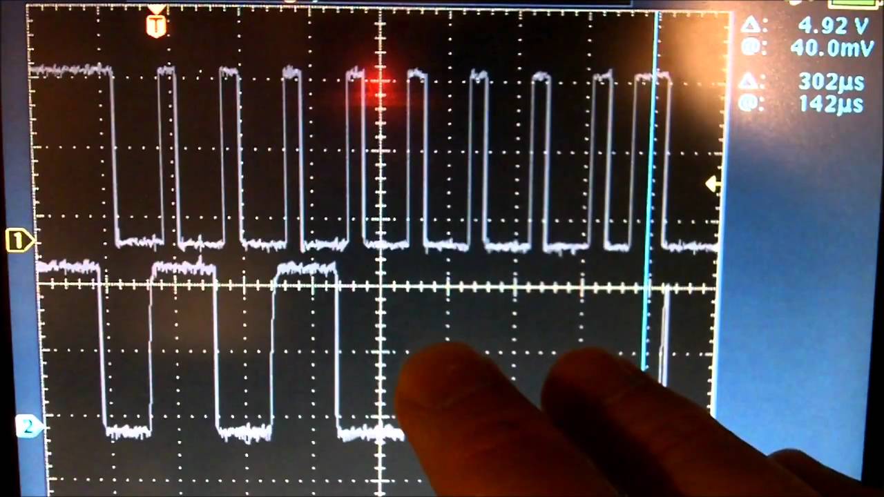
However, I just noticed that this i2c reverse engineering youtube video (Tektronix):
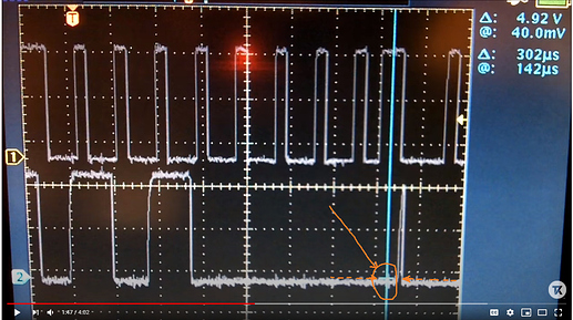
has a really nice tiny flat line that sort of “rides” the top of the wave as the user scrolls horizontally through the sample points. I think that’s a really cool useful feature! It’s an easy visual cue to determine if various high sample rate data points are higher or lower relative to each other, as you scroll across!
(really I think… the horizontal line… is inherently drawn by drawing a “+” sign target on the precise sample point)
Let me know your thoughts!
Thanks,
Conor


